I believe my magazine is aimed a young girls, and you can see this through the color scheme and design. As my magazine is targeted at a much younger audience compared with your typical music magazine audience, i feel it is hard to select a specific psychographic group. However if i was to select a social group, i would probably choose ABC1. This is because this covers a wide class being Lower middle class, middle class and upper class.
Tuesday, 10 May 2011
In what ways does your media product use, develop or challenge forms or conventions of real media products?
When i researched and looked into the type of magazine i would like to do, i found that most music magazines were aimed at an older audience and happened to be with in the genre of Rock. Music is creating for everyone to listen, so that is why i wanted to produce a children's music magazine, this will be a place where younger children (mainly girls) can talk about there favourite music or band. I feel creating a children's music magazine is hard and does challenge regular conventions of real media products, as stereotypically children - especially girls are interested in younger teen stars which may not appeal to everyone.
Tuesday, 26 April 2011
Technology Evaluation
When creating my foundation production magazine, it was a good chance to learn the different softwares. I started off using 'Pages', this was to learn how to produce a good layout and be able to over lap images. Compared to my music magazine, the school magazine was very basic. This was because i did not know how to use the software correctly, however through practice i have learnt the different techniques on pages such as wrapping, cropping and making objects transparent with this i feel i have produced a professional looking music magazine. Pages was the only programme used, i would of liked to use a more complexed editing software like photoshop but my images didn't require it.
Music Genre Evaluation
When picking my music genre i had to make sure i used the correct house-style to represent it. I also had to make sure my music genre was suitable for my target audience. Firstly i looked at the targeted audience, and what that audience would listen to. To do this i researched the age group and found that most of the girls watch and listen to disney stars, which fits into the 'Pop' genre. I then had to make sure the house-style was applicable to the genre, by doing this i had to look at similar magazines which are targeting the same audience. One magazine i looked at and based my final house - style on was 'Girl Talk Magazine'. I loved how seeing just that bubble font for the main title it automatically appeared to be girly, and i also felt it represented 'Pop'.
Title and Text Evaluation
When designing my music magazine, i needed to think about my targeted audience, and which fonts would suit the genre of the magazine. I researched magazines with a younger target audience, and i also thought about the typical font that may be used to represent 'Pop'. I found a font which was very rounded, this was typically found when researching 'Pop' fonts. I decided that i would use this particular font for my main title of the magazine. However when it came to the other text on the front cover i then looked at similar genre magazines, and they had used a variety of different fonts for the text. This gave a good effect and decided i would use this idea to. On my D.P.S and contents page, i stuck to the same house-style as the front cover, and for main titles i would use the rounded bubble font, and for smaller texts use different fonts. On my D.P.S with in my interview i stuck to the same text the whole way through, this was to avoid confusion. However i included quotes taken from the interview and placed them with in the chunk of text in a much bigger, and different font to allow the quotes to be noticed and stand out. I have seen this technique used before in other professional magazines, and feel it works well.
Friday, 8 April 2011
Improvements
Print professionals - Steve Priddell and Rowland Cowley UWE Print and Design Division I presented my Front Cover, Contents Page and Double Page Spread to the print professionals and then gave me a couple of improvements to make on my magazine. 1) Change the cover of the main mast head 'Pulse'. They felt that the pale pink needed to be a darker pink, as it merged into the other text. 2) Move text overlapping the background image on the front cover, so that the image can be clearly seen. 3) On my double page spread, they suggested i move the coloumns over and possibly add another image with in the page. I have applied all these improvements on to my magazine, images below show the final copies featuring the improvements.
Thursday, 7 April 2011
Final Music Magazine 'Pulse'

Front Cover - Pulse
This is my contents page for my music magazine. I took a lot of time deciding on the layout of the magazine, as i was trying to follow a suitable grid. I also looked at 'Girl Talk' magazine, which has quite a busy front cover. I tried to copy this look on my magazine cover as 'Girl Talk' has the same target audience as what my magazine has.
Double page spread - Pulse
This is my double page spread, i have added a faint background image behind the text, and other images. To make the double page spread more realistic, i looked into adding quotes taken from the interview.
 Contents Page -
This is my bright contents page, it features an editors note introducing what is in the current issue of 'Pulse' and also images that are included with in the magazine.

Thursday, 24 March 2011
Music Genre Examples
My main genre for my music magazine is Pop. One of the inspirations for my photo shoot and my 'up and coming pop artist' section on my double page spread is Taylor Swift. I have tried to copy her look through the photo shoot, heres an example of her music.
http://www.youtube.com/watch?v=XPBwXKgDTdE
http://www.youtube.com/watch?v=XPBwXKgDTdE
Music Magazine Photo-Shoot


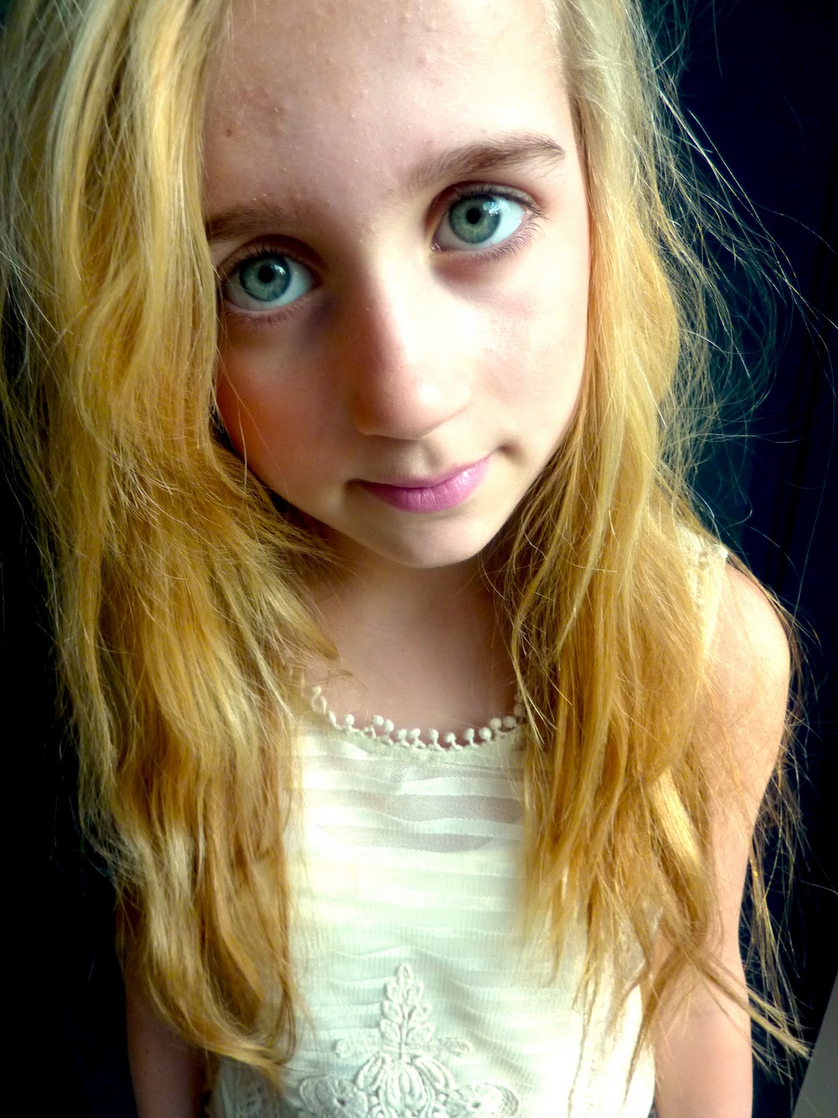


I arranged this photo shoot to be held on Wednesday 23rd March, I planned the look i wanted by the earlier images i found of Taylor Swift. So i asked my sister to model for me with her guitar, the look i went for was a girly image, this is to suit the pop genre of the magazine. I wanted to copy the look with the guitar as this is a clear relation to music. All these images above are possible front cover, and double page spread images. However a close up of her face will be the front cover, and an image with the guitar will be on the double page spread. I love the colours in the close up images, i edited all the images, so the contrast and temperature was high and changed the exposure. I also changed the saturation in some images the vary the shoot.
Wednesday, 23 March 2011
School Front Cover Photo-shoot

This was the final image for the front cover of my school magazine, I love the back lighting and how the school badge is brought out against the black.
Monday, 21 February 2011
Targetted Audience - Music Magazine
I will produce a magazine which will be particuarly based on music. Unlike your typical music magazine which is normally aimed at older teens and adults, and normally looks are the rock star image. My music magazine will look at up and coming teen pop stars. My targetted audience will be early teens aged 10-15 being mainly girls who are interested in music and maybe themselves are up and coming musicians. I hope to protray my targetted audience by featuring on the front cover one of the young up and coming singers. (This will be my model, who is my younger sister) I will use attractive colours which will be bright and reflect the theme of 'Pop' i will try not to be stereotypical with the colour scheme, however my magazine is typically aimed at girls therefore my colours will have to be girly. But maybe not just use the colour pink.
Taylor Swift

I love this image i found on the internet of Taylor Swift and her guitar, i would like to reproduce this image and feature it either on the cover of my magazine or on my double page spread.
Magazine Analysis - Rolling Stone Cover

The 'Rolling Stone' magazine is a very famous magazine related to music and specifically feature articles and front covers on famous musicians. This particular magazine features the teen music icon 'Taylor Swift'. I love this image with the guitar, and it has given me an idea to use a similar image for my music magazine. I will take a picture of my sister with her own guitar. I like how the main title 'Rolling Stone' is hidden behind the models head. However on this cover it is hard to read as 90% of the title is hidden. Unless you had heard of the magazine, you may have a problem working out what the magazine was. I like how all the sub headings and tag lines are all aligned to the right of the magazine.
Magazine Analysis - Total Girl Cover

This magazine is specifically aimed at young girls and young teenagers. On the front cover is a Disney actress 'Selena Gomez', This attracts the targetted reader. Like the previous magazines i haven chosen to look at, they all feature a similar colour palet of the pinks and blues. I love how the background is just white, it really brings out the model and makes her stand out. I would like to do this with my front cover, but if not hopefully slightly fade the background out. I feel the overall cover is a bit fussy featuring to many sub headings, i also don't like how the are put on a slight slant. This makes the magazine appear untidy compared to one with straight headings.
Magazine Analysis - Teen Vogue Cover

This is the ever so popular 'Teen Vogue' magazine. Compared to 'Vogue' which has a targetted audience of women interested in high fashion. Teen Vogue is directly aimed at teenagers interested in fashion. My own magazine will target the same audience. This is why the magazine feature teen idols such as on this magazine 'Vanessa Hudges' an actress from 'High School Musical'. This automatically attracts the right audience to read the magazine. Again the colours of the again fit the girly, summery image. This is using colours like pale blues, pinks, and yellows. Unlike the previous magazine there is a lot more sub headings advertising what is in the magazine. I love how the background image is just the model. I am hoping to do this in my own magazine.
Magazine Analysis - ASOS Cover

This is an online magazine by the retail company ASOS. The targetted audience of this magazine is for women who have an interest in the website http://www.asos.com/ . Readers can prescribe to the online magazine so it is delieved to there home. I chose this particular asos magazine to analysis because it relates to the type of magazine cover i would like to produce. I love the high exposure which hides the definiton of the features on the models face. The colour of the main heading brings out the models eyes as they are the same colour. The pink jacket on the model makes the cover bright and girly this is the effect i would like to have on my front cover. There is only the main heading and a couple of sub headings, i love how this makes the cover look simple and not cramped and fussy.
Thursday, 3 February 2011
Front Cover Flat Plan for Music Magazine
This is a sketch of my contents page for my music magazine 'Pulse'. I will include as well as the contents of the magazine, an editors note. This will be a small paragraph explaining what is featured in the magazine. I will also include an image of teen pop star Taylor Swift. This will be showing that she is featured in the magazine. On my drawing i have made sure the type face of the mast head 'contents' is the same housestyle as the main mast head on the front cover 'Pulse'. I have done the same with the numbers on the contents.
I will use this image of Taylor Swift on my contents page...

i have choosen to use this image because it fits the 'pop' genre. This is also the similar colours i would like to use in my own photoshoot.
This is the drawing of my contents page...

I have choosen a bubbily font to represent the 'Pop' genre. The mast head will over lap the back ground image, which will be a photo of my model. I will include strap lines to advertise the content of the magazine, and i will also include images.
Ideas for my Music Magazine
I want to produce a girly music magazine, this is why i have selected this example. I am hoping to use my sister as my model for my music magazine. I will use her as a pop star and take pictures of her close up and then maybe a photoshoot of her with her guitar.

Friday, 7 January 2011
Double Page Spread Flat Plan
This is a flat plan of my double page spread which i will include in my magazine. The masthead is 'Lily' this is the name of the singer. I am following the orignal bubble housestyle for the mast head. I am going to use a black and white image on this page, it will be atleast half the size of the double page, and will include an interview overlapping the image. I have done some research for the image i would like to include, and i have found a few featuring a guitar.
This is the sketched of double page spread...

Double Page Spread Research and Analysis

I have made a few notes on an example of a double page spread, i have said what i like and dislike and also what works and does not work. This has given me some ideas so that i can draw up a flat plan for my own double page spread.
School Magazine
I set up a photo shoot of someone from my school. I made sure that the school uniform was on show so that you could clearly see the genre of the magazine. I edited this final image for the front cover so that the contrast was high, this made the school badge on the models jumper stand out.

The name of my school magazine is 'Learner' i feel this represents school.
.
Contents Page Ideas For School Magazine
When creating my contents page for my school magazine, i must make sure it is suitable for my targeted audience. It is also important that i stick to the same house style throughout using the same type face and colour scheme as the front cover. This then does not confuse the reader. With in my contents page i will be clear on what is featured inside the magazine. I will include maybe an interview with the head teacher, achievements, results and events, student messages, and a parents page.
Front Cover Research

This is the first magazine i liked the look of, this is because it is following the same layout which i would like to feature on the front cover of my magazine. I also love how they have linked the colour of the text with the shirt on the photograph, this makes everything look organised and neat. This magazine has also included the issue date underneath the main heading 'School Sport' i also want to inlcude this.

I love the colours on this front cover. This reflects the kind of image i will include on my front cover as this photograph has obviously been taken during a drama performance meaning there was artifical lighting. I love how they have made part of the heading bold, This looks effective and i may use this idea in a different way.
Front cover ideas
For my front cover I will look and compare my ideas against other school magazines. This is so it looks appropriate. So far I am thinking of featuring an image of a student or students in a lesson or taking part in a school activity. I only want one image as the background of the magazine compared to a few images merged together. This is so I don't make the front cover look to confusing. I will feature the main heading on the top centre of the page, closely underneath I will feature the issue number date. Overlaying the images I will have subheadings which will say what is included in the magazine.
I will do some research on front covers and post what I find, before I look at my contents and double page spread.
I will do some research on front covers and post what I find, before I look at my contents and double page spread.
Targeted Audience and Purpose
As my magazine is a school magazine it will meet the targeted audience of secondary school students. This is ages 12-18. My topic I will focus my magazine on is subjects and activities that have happened around the school environment, so I will also include achievements and awards that the students have been awarded. I feel ages between 12-18 are most likely to read the magazine as they will be pupils of the school. The purpose of this magazine is to interest and inform students on the latest goings on with in the school. It will also give an insight to students who are interested in taking different subjects for GCSE or A Level.
Subscribe to:
Comments (Atom)